Draw Calls: What They Actually Are and Why Everyone Tells You to Reduce Them
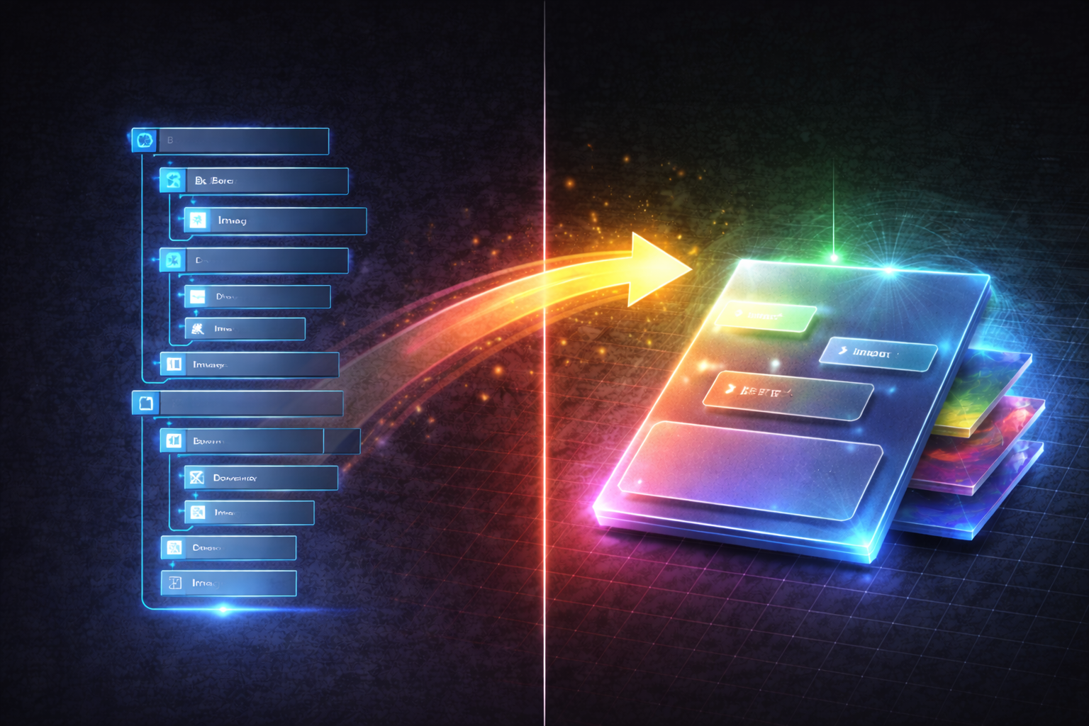
UMG is powerful and fast to work with — until it isn't. Once your UI starts getting complex, nested widget hierarchies become a real problem: each Border, Overlay, Image, and Canvas Panel adds a node to Slate's widget tree. More nodes means more work during layout passes, more invalidation overhead when anything changes, and more draw batches being generated every frame. The widget tree doesn't have to be enormous before you start feeling it — especially on scenes where multiple complex widgets are active at once.
On Desert Revenant and Desert Revenant 2 this showed up across three distinct UI systems. In each case the root cause was the same: a group of purely decorative Image widgets stacked on top of each other, each existing as a separate node in the hierarchy for no functional reason other than "that's the obvious way to build it."
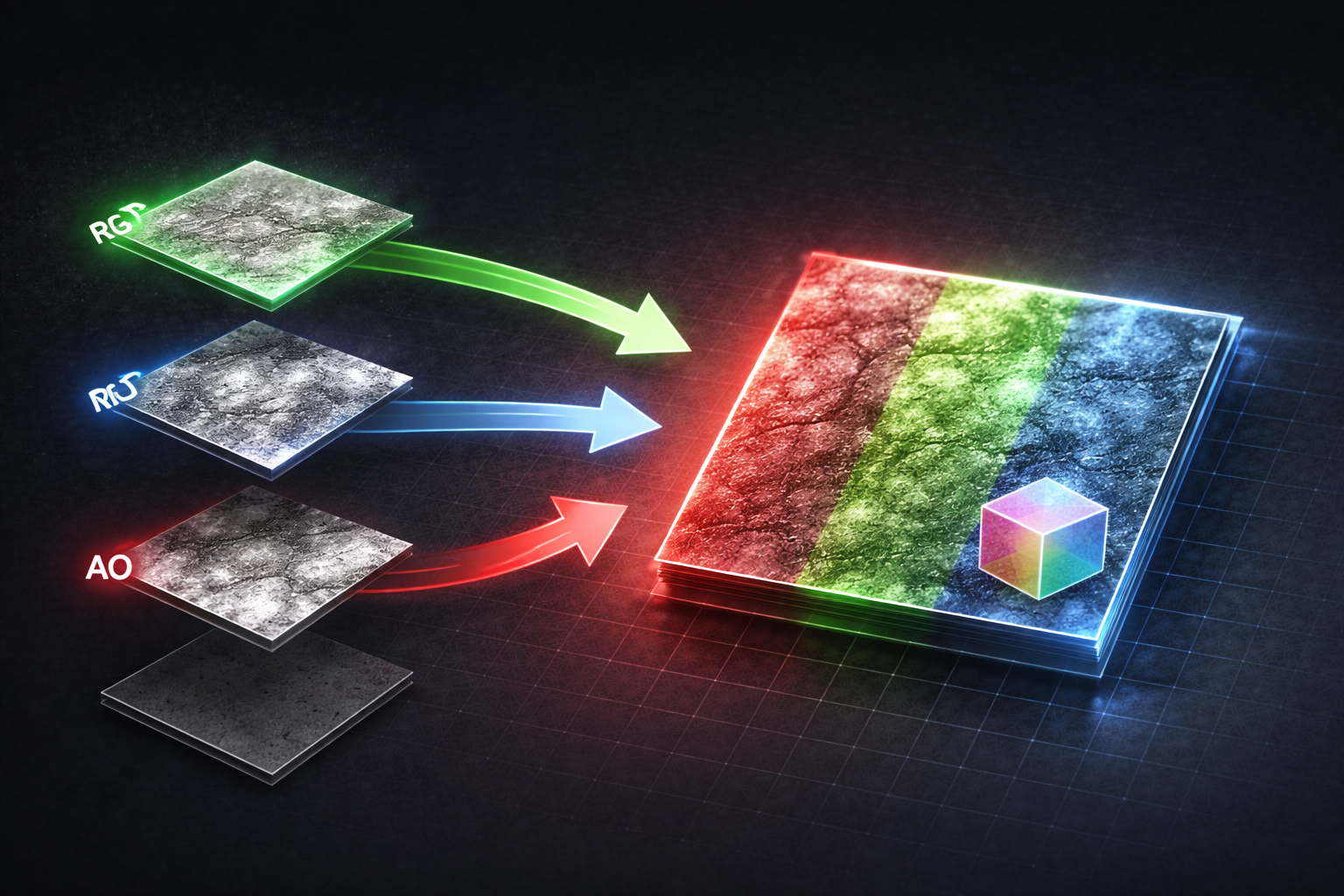
The underlying principle is simple: if a set of stacked Image widgets is purely decorative — no independent interaction, no per-widget animation, no dynamic data that needs individual invalidation — there is no reason for them to exist as separate widgets. You can composite all of those layers into a single UMG-compatible material and render the entire thing with one Image widget. One node in the tree. One Slate batch entry — instead of six separate widgets each breaking Slate's batching with a different texture.
In the material graph, each visual layer becomes a Texture Sample node. You composite them manually using Multiply, Lerp, and Add nodes — the same operations you'd use in Photoshop, expressed in the material graph instead. Anything that needs to vary at runtime — a rarity tint, an active/inactive state, a selection highlight — becomes a Material Parameter that you set from Blueprint. The material instance handles all the visual variation; the widget itself stays exactly one Image node.
The shift in thinking is going from "each visual element is a widget" to "each visual element is a layer in a material." Below I'll walk through how this played out specifically across the spell cards, enchantment slots, and the Revenant selection widget in Desert Revenant, and what the different states looked like in practice.
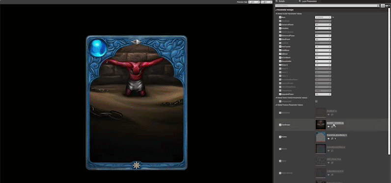
The most visible instance of the problem was the spell cards. Each card in a player's hand was composed of roughly six to eight separate Image widgets stacked on top of each other — a base background, a rarity-coloured frame, a gem overlay, a glow effect, a foil highlight, and a mask cutout for the card art. All of them existed as independent sibling nodes in the widget tree, and every time a card was added to or removed from the hand, all of those nodes had to be created, laid out, and invalidated.
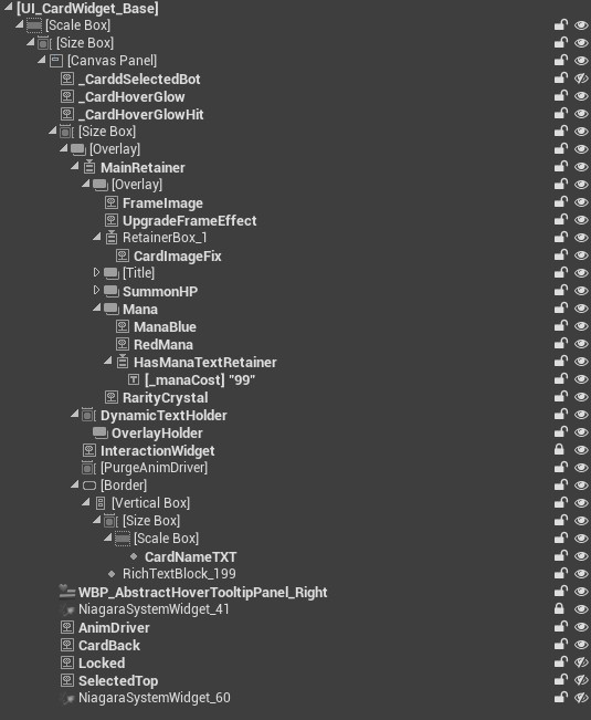
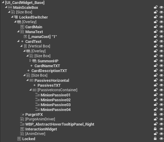
Consolidating those into a single material dropped the widget count for a full hand of eight cards from roughly 80 nodes down to around 20. But the spell card material ended up exposing significantly more parameters than the other widgets — because a card has a lot of visual states to cover, all from one Image node:
The enchantment slots had the same layered structure. Each slot displayed a background, an active or inactive state indicator, a frame overlay, and a locked state overlay when the slot was unavailable — four Image widgets per slot, multiplied across all visible slots on screen simultaneously.
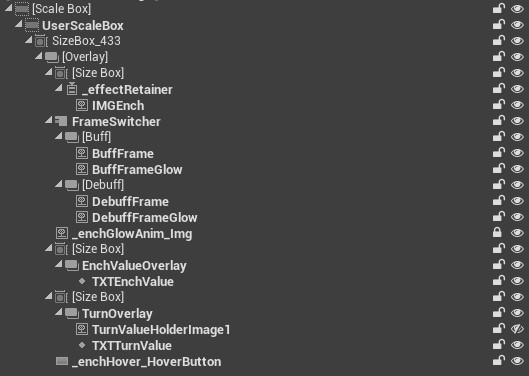
What makes the enchantment material particularly interesting is that it goes beyond swapping textures — the slot shape itself is procedurally generated using a Signed Distance Field written in HLSL, meaning the shape is a parameter too. A single material instance handles all of this:
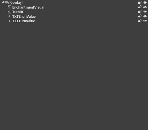
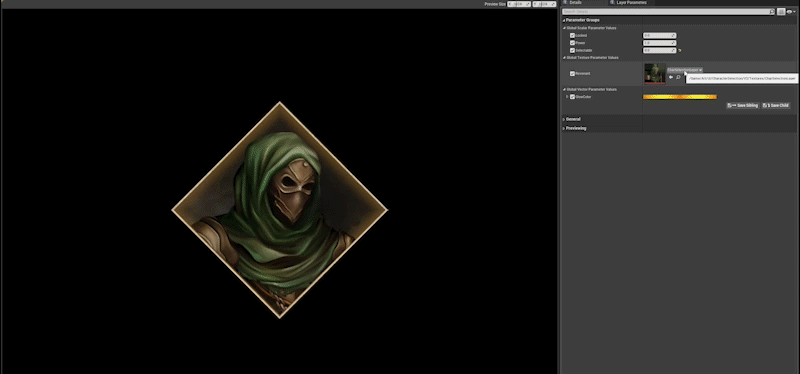
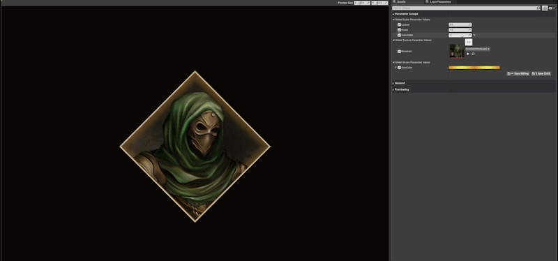
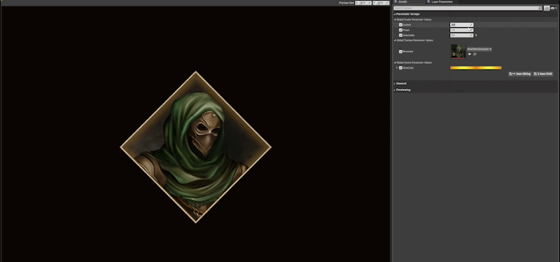
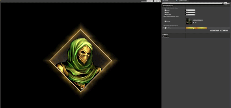
The character selection screen used a dedicated widget for each selectable Revenant — and each of those widgets was built from several stacked Image nodes forming the portrait frame, background glow, selection highlight ring, and state indicators for locked or unlocked characters. Here's what the widget looked like before the consolidation:
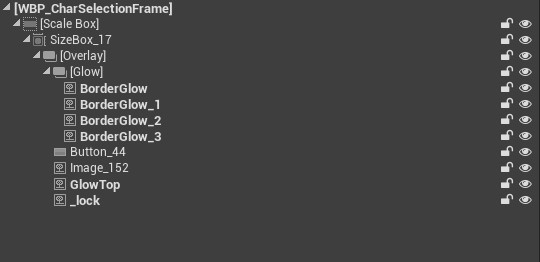
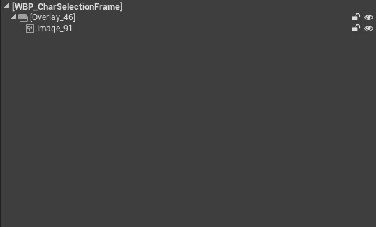
Each of those visual layers — background, frame, glow, state indicator — existed as its own Image widget in the hierarchy. The selection highlight and locked state were handled by toggling widget visibility rather than driving a material parameter, which meant Slate had to re-invalidate the layout on every state change. Collapsing everything into a single material eliminated those per-layer invalidations entirely. One widget node per Revenant card instead of five or six.
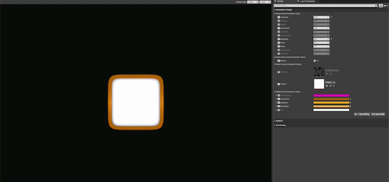
What makes the material genuinely flexible beyond the hierarchy reduction is what it exposes as parameters. A single material instance handles all of this:
This technique works best for static or semi-static decoration. If a layer needs to respond to input, animate independently, or bind to a changing value every frame, it's usually better to keep it as its own widget — the overhead of a per-frame material parameter update is fine, but you lose the ability to invalidate individual pieces cleanly.
A few things to keep in mind when you go down this route:
SlateDebugger.Start in console) to confirm you're actually moving the needleOn Desert Revenant, consolidating the decorative layers across spell cards, enchantment slots, and the Revenant selection widget reduced the overall widget count across those screens substantially — a full hand of cards alone went from roughly 80 widgets down to around 20. Draw batches dropped noticeably, and iteration time on each widget's visuals improved significantly because there was one material to edit instead of several assets scattered across a deep hierarchy.
On Desert Revenant 2 we carried the technique forward from day one, applying it proactively to new UI systems as they were built rather than retrofitting it after the fact. The result was a cleaner widget tree from the start and far less time spent diagnosing Slate performance issues late in development. Lesson learned: it's much easier to build flat hierarchies upfront than to flatten them after an artist has spent a week nesting widgets.
Found this useful? Share it: